Building like it's 1984: A comprehensive guide to creating intuitive context menus
Context menus have existed for decades, from macOS to Windows, from Xerox Parc to the web. They’re a widely understood user interface concept, but many new apps still fail to deliver them at the standard users have come to expect.
Since the context menu paradigm has existed for so long and is so widespread, users anticipate them to behave in similar ways across platforms and apps. But in reality, they don’t! In fact, each new web app creates their own custom menus, and users have to relearn what is possible and what is not in each app. Moreover, just like with the best animations, a great context menu should feel so intuitive that users don’t even stop to think about it.
In this post, we’ll go through some of the basics, as well as some more advanced interactions, for building seamless context menus.
The basics
Context menus are menus that appear upon user interaction, usually from a right-click or clicking a button. They have many names (pop-up menus, dropdowns, contextual menus), but they usually look pretty similar across different operating systems and apps. What does differ — however — is how they behave during user interactions.
Note: while context menus also exist on mobile devices, this post will focus desktop menus.
They may look simple, but context menus can actually be quite intricate. We’ll go through the details one by one to break down the context menu user experience.
Position menus correctly
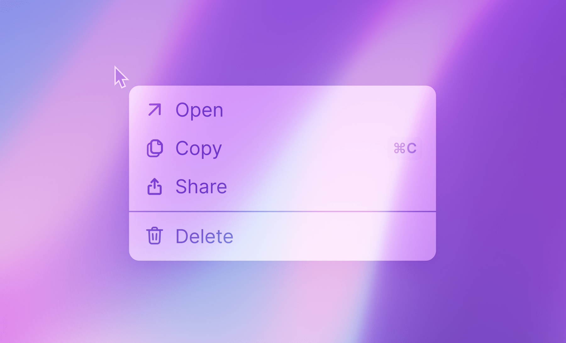
There are two main ways to open a context menu these days: from a right-click, or from a button-click.
Here’s an example of opening a context menu from our app:
If there is enough space, context menus align their top-left corner to the bottom-left of the cursor or button. They’re extremely predictable, as they should be — a user should instinctively know where to move their cursor to next.
It’s also a nice touch to highlight what the context menu is attached to, so the user clearly understands what their selection will be applied to (see the examples above, where the task and button are highlighted while their menu is open). Look around, and you'll see this is actually also true on macOS and Windows when right-clicking a folder or file.
Reposition menus as needed
There are many instances where menus need to be repositioned as they approach an edge of the screen.
The consensus logic is to position the menu to the opposite side of the origin frame, which basically means inverting the horizontal/vertical axis to align menus.
Example: if a menu aligns their top-left corner to the bottom-left of a button, but doesn’t have space vertically, we can simply invert the vertical axis. So the menu would align their bottom-left corner to the top-left corner of the button.
One simple thing to do is monitor the window dimensions and re-layout the menus on the fly, so they can work in any situation.
Add keyboard navigation
Type-to-select
Though it's so useful and seems obvious, type-to-select is a feature that's often forgotten in newer apps. The most common implementation is to listen for keystrokes and automatically select the first menu item that matches the same prefix. At Height, we build a solution using match-sorter to be more forgiving as people might miss a keystroke when typing fast.
Keyboard navigation
Your context menu should be navigable through keyboard shortcuts. This is another one that seems unpredictable on the web these days, yet it's so obvious in retrospect. And of course, a nice little touch is to cycle through the menu when reaching the end of the options.
| Shortcut | Action |
|---|---|
| Enter | Select action |
| ↓ | Select next |
| ↑ | Select previous |
| ← | Close submenu |
| → | Open submenu |
| Esc | Close menu |
Give hints to the user
Feedback on click
Something that makes context menus special is that they disappear right after being used. Adding some form of feedback after you’ve clicked an action is important to convey to the user that their action was successful. We stole the flashing indication from macOS, but there are many other ways to deliver a similar feeling of confirmation.
Menu anatomy
Copy-writing and information architecture might be the most important part of user interface. When it comes to designing the content of a menu, there are a few rules that are easy to follow to stay consistent and feel predictable to an user. Apple does a great job going through best practices around naming and organization menu. A few highlights:
- Separate menu items with dividers, based on their similarity or relation with each other.
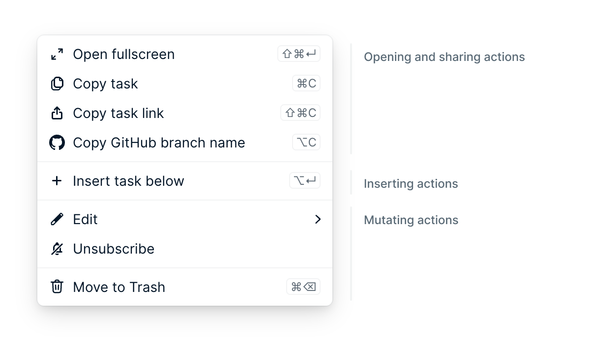
- Disable menu items instead of removing them. A user can then discover actions, and be greeted by a menu that looks the same in any context. It’s also clearer to users that an action isn’t supported when it’s greyed out rather than just completely missing.
- Display shortcuts next to menu items to increase their discoverability.
- Suffix “…” to menu items that require user input to indicate the user needs to do something.
Simple and fast transitions
Animations are often used as transitions from one state to another. They’re important because they help the user understand the link between their actions and their effects.
Context menus are user interfaces designed for productivity. Speed and predictability are extremely important, and animations can quickly obstruct these goals.
At Height, we decided to briefly animate the primary context menu, but disable all submenu animations. To us, it gives the user the best of both worlds: a way to better understand how a menu relates to its environment, while keeping complex menus a blast to navigate.
Intuitive access to submenus
An interesting problem with submenus is: how do you access them with your cursor before they get disappear? Specifically, you would see this problem when moving your mouse diagonally towards the submenu.
There are different solutions to this problem:
Delay
The simplest solution to this problem is to keep the submenu around for some time after leaving its parent menu item. If the submenu gets selected, it stays around and its parent menu item gets reselected.
Unfortunately, there are two issues with this solution:
- It feels a bit janky to have a submenu open while another menu item is selected. Example: "Show visualizations options" is selected, while the "Sort by" submenu is visible.
- When going through different menu items rapidly, there will be a delay for submenus to appear, causing the user interface to feel unresponsive.
Safe triangle
Amazon used to have a big dropdown menu and it became famous for the way it toggled submenus while moving your cursor. The basic idea is to show the submenu while the cursor is within a safe triangle.
macOS also uses the safe triangle principle and adds a timeout to disable the safe triangle logic. This makes it easier to select siblings while staying in the safe triangle.
Here's a showcase of this concept, with the safe triangle visible for comprehension.
Content overflow
In some rare cases, context menus cannot be repositioned in a way that shows their entirety. There are two ways to avoid this problem.
macOS chose to let the user scroll through the menu using arrows, going through menu items one by one.
At Height, we didn’t like this solution as it is a bit cumbersome to navigate. Instead, we added a scrollbar into our menus that is shown when needed to let users know when a portion of the menu is hidden. We think this is a more modern way of solving this problem.
So as you can see, building context menus is quite a bit more complicated than it looks from the outside! Hopefully this guide will give you a better understanding of what goes into them, so you can more easily improve those that exist or implement future ones.
At Height, we're really passionate about these kinds of things, and the user interface and experience overall, so this guide was a fun one to put together. Drop us a line if there are any other things you're curious about seeing a breakdown of!