Building like it's 1984: Scrollbars in web applications

Similar to context menus, scrollbars are so ubiquitous that users, software developers, and designers rarely think about them.
Although they looked and behaved similarly in the past, scrollbars haven't converged completely across systems and platforms. The scrollbars of Windows 10 haven't changed much from those of Windows 95 (a 20-year gap!) — their scrollbars still feature two buttons and a draggable slider. On the other hand, macOS have completely revamped their scrollbars over time, influenced by trackpad usage growing over mouse usage, and the ubiquity of touch screen devices.
History of the scrollbar
Web applications scrollbars
As with other type of controls like buttons and inputs, web applications have a choice to make when it comes to scrollbars: use the platform native scrollbars, or choose to build custom ones.
Here are three examples of vastly different web applications that chose to build custom scrollbars. With them, applications can then control scrollbars behavior granularly, add features specific to their use case, or simply add consistency throughout their UI and the different platforms they run on.
In this article, we will look at how web applications can use custom scrollbars to improve their user experience, and will go through a few best practices we've found work well in Height.
Cohesive experience
Scrollbars currently vary in style and behavior across the different OSes, browsers, and scrolling devices (e.g., trackpad, magic mouse, mouse with wheel, …).
Height is an app that runs primarily on the web. With native scrollbars, it meant that different browsers/OSes would display Height differently, and that using a different scrolling device would drastically change how Height renders.

Windows and macOS with scroll wheel have the biggest scrollbar footprint, they actively reduce the displayable content, even when not being used. Height took the hide-able scrollbar concept of macOS further and reduced its hit area even more. What's important is that we render this scrollbar type on every platform, making Height Windows as enjoyable to use as the best case on macOS.
When designing user interface for invisible scrollbars, we need to pay attention to the invisible track to avoid overlap between the scrollbar and the content.
Designing user interface with enough padding around the content to avoid overlap
When applying these two concepts together, we can have a clean user interface, no matter the scrolling device or operating system. Here's how Height evolved from using native scrollbars to custom ones:
Custom scrollbars allows Height to stay consistent across platforms, and not overwhelm users with visible tracks.
Improve discoverability
Invisible scrollbars sometimes make it difficult to discover overflowed content. On macOS, scrollbars are only displayed on scroll, which makes it hard to discover them or to even realize there may be more content hidden from sight. It also become difficult to scroll by dragging the scrollbar itself, since it disappears really quickly after scrolling.
On Height, we display scrollbars on mouse over of the scrolling area. It solves both of these problems while keeping the UI uncluttered.
Add custom behavior
Since we built fully custom scrollbars, we have full control on when to display them. In Kanban boards, we decided to display scrollbars at all times for scanning reasons. Since we made scrollbars extremely compact, they also don’t feel overwhelming.
Kanban being a visual tool, we wanted users to grasp roughly how many tasks were in each column.
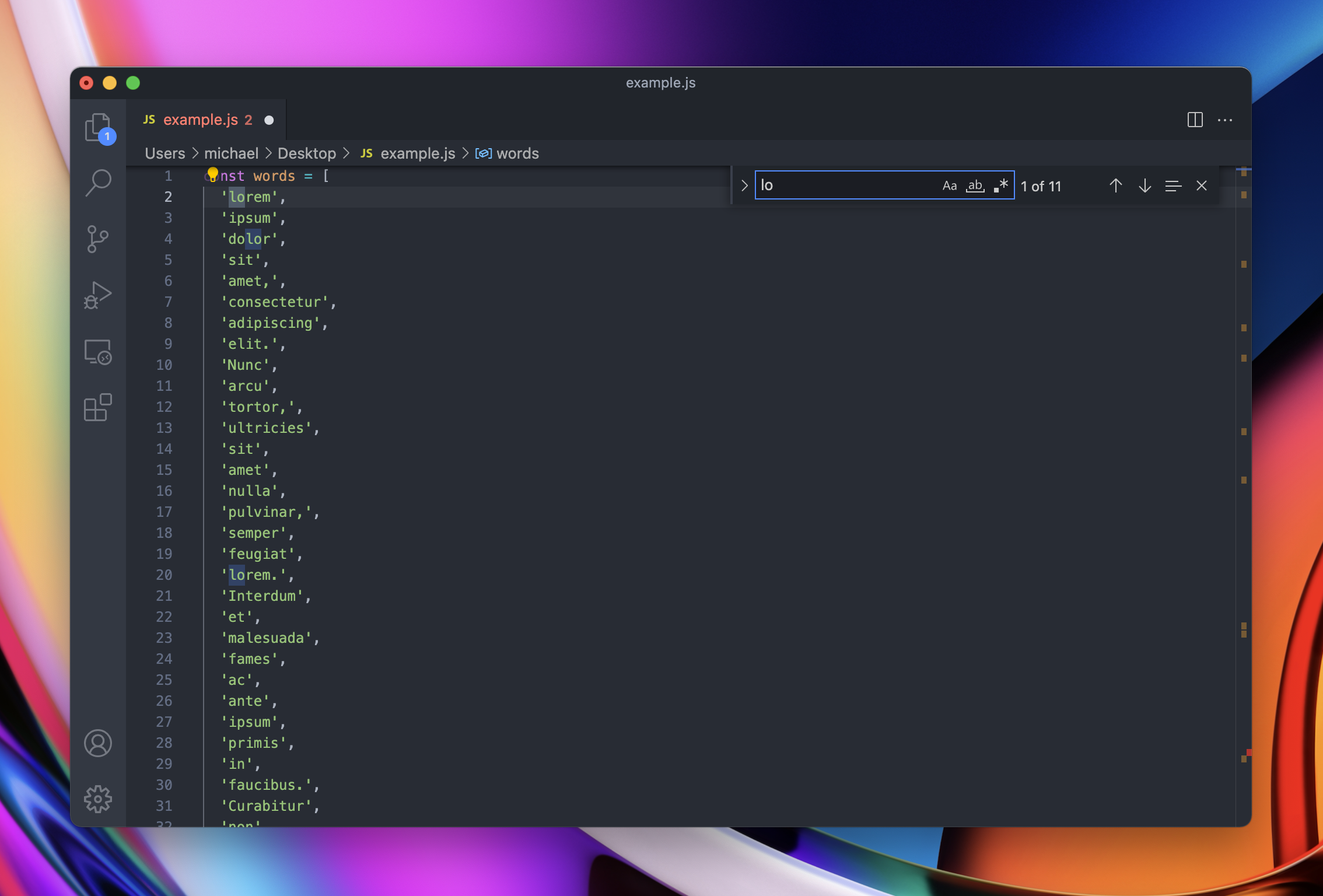
VSCode is another great example of custom behavior. Their scrollbars have a larger track which is used to indicate to the user where errors, or search results occur in a file.

Performant implementation
The most important aspect of custom scrollbars is performance. Scrolling should stay smooth and unperturbed by random slowness of your computer.
For best performance, here are a few implementation tips:
- Keep the underlying scrolling native: do not override scrolling with javascript, let the browser handle it. In practice, this means keeping CSS overflow, but hiding native scrollbars.
.ScrollView {
  overflow: auto;
  -ms-overflow-style: none;
  scrollbar-width: none;
}

.ScrollView::-webkit-scrollbar {
  display: none;
}- Avoid layout thrashing when rendering or measuring scrollbars. An easy way to do so is to use fastdom.
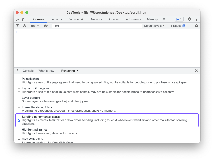
- Make sure scrolling doesn't happen on the main thread. On Google Chrome dev tools, you can turn on Rendering → Scrolling performance issues to discover potential issues.

In summary, custom scrollbars can help:
- Control how and when scrollbars are visible
- Maintain a consistent scrolling experience across platforms
- Add software-specific features to scrollbars
Building custom scrollbars is an investment, but it’s one worth making. Poorly done, unintuitive, or non-performing scrollbars wreak havoc on the user experience—but done well, that small detail drastically improves your app while feeling invisible to your end users. At Height, we aim to be really intentional about building, from seemingly small details like scrollbars and context menus to core features and workflows. We’re excited to continue sharing our story of building a PLG product so you can develop your own product strategy. If you’d like to try the first-of-their-kind autonomous workflows we’re building at Height, sign up today…and make sure to follow along with our blog for more posts like this in the future.
