The mock landing page approach: how to create the perfect PLG product roadmap
As we shifted gears and started building Height 2.0 last year, our goal was (and is) to automate and eliminate as much manual project management work as possible for our users. And to do that, we naturally started with a round of user research to identify which use cases would be the most impactful to automate. Once we pinpointed a handful of use cases, our team developed an effective new way to present the insights: mock landing pages, created to spark meaningful conversations within our product team and help shape our roadmap.
What is the mock landing page approach?
Our team wanted to take the traditional insights gained through user research and go one step further. Like Amazon's "work backwards" approach of creating mock press releases to iterate on a product before ever building it, we took the use cases identified through user research and mocked up landing pages to show our product team.
Just like an actual website landing page, these mock landing pages tell the story of how a set of features create an ideal end state and solve for specific pain points. Additionally, customers of PLG startups make decisions about products to buy or when to upgrade by looking at landing pages, not through conversations with sales or success teams. That's why a landing page-based approach directly aligns the product team's thinking with that of a customer visiting a product landing page for the first time.
When done well, mock landing pages inspire product teams to build potential solutions grounded in real customer input.
How we created mock landing pages to inspire our product team
Step 1: Copy development
Immediately after completing user research interviews, every use case can feel compelling and viable — after all, you've just had deep conversations with people about what's frustrating and painful about their work processes. Though you'll begin with a number of use cases, the process of drafting copy, refining it to fit the mock landing page format, and ultimately, presenting to the team will naturally whittle down your list to only those that are the right fit for your goals.
To start identifying those best-fit use cases, you'll kick off the landing page development by creating two documents: a messaging document to transform the user research insights into talking points, and an actual initial draft of the mock landing page copy.
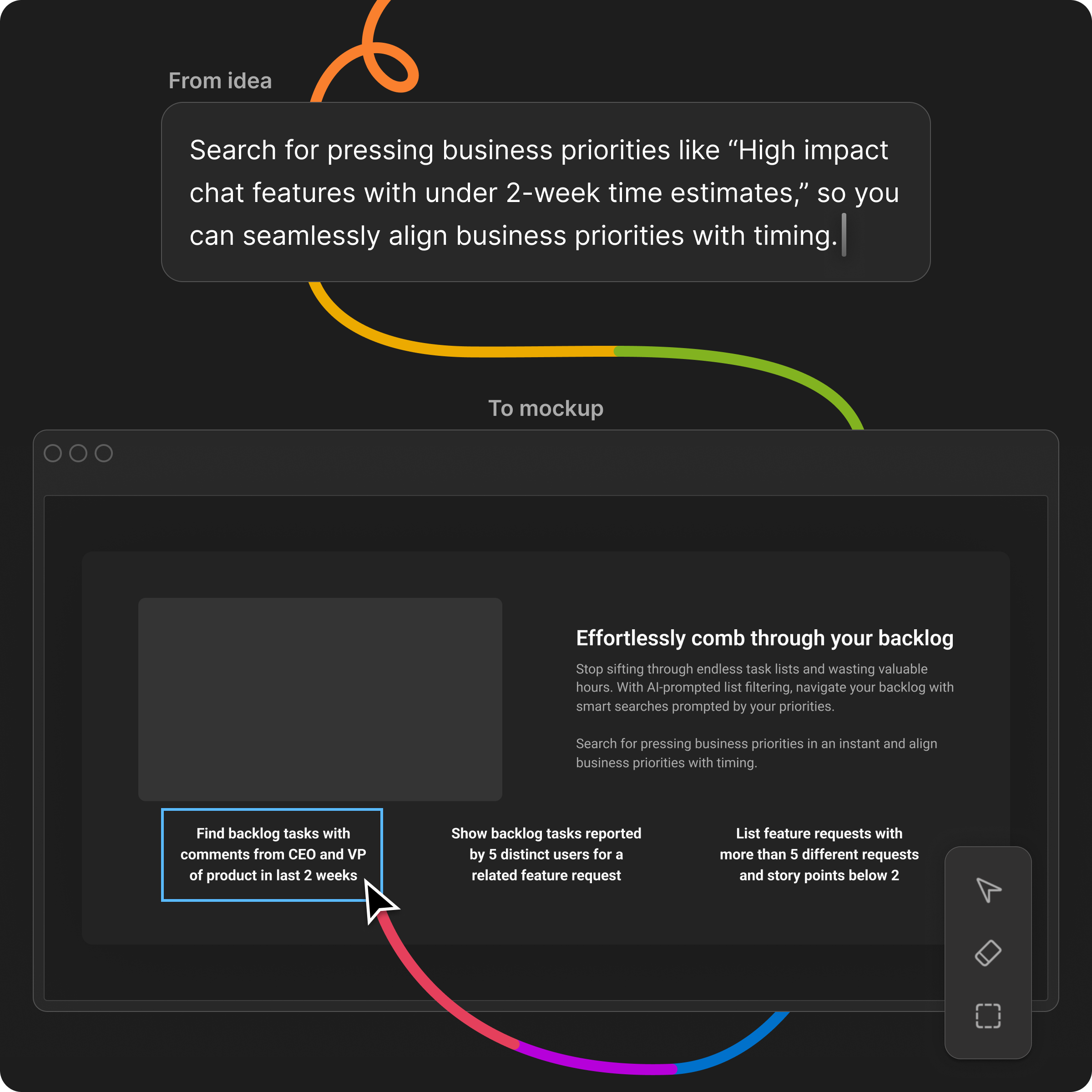
As you start drafting the mock landing page copy, you'll use the messaging document and the rest of the user research insights gathered to write a compelling page. Since user research itself unveils pain points, current situations, and ideal end states, these three areas naturally translate into the foundation of the mock landing page copy. At this point, the content you write for the mock landing page should largely focus on depicting those end states as emotional responses. For us, that meant imagining what life would look like if a certain use case was fully automated and taken off the user's plate.
While writing the landing pages, one really important thing is to make sure you're "solutioning without solutioning," or more aptly, presenting an argument for how to potentially solve a particular use case without explicitly ideating product features for your team.
Step 2: Refining copy to fit an actual landing page format
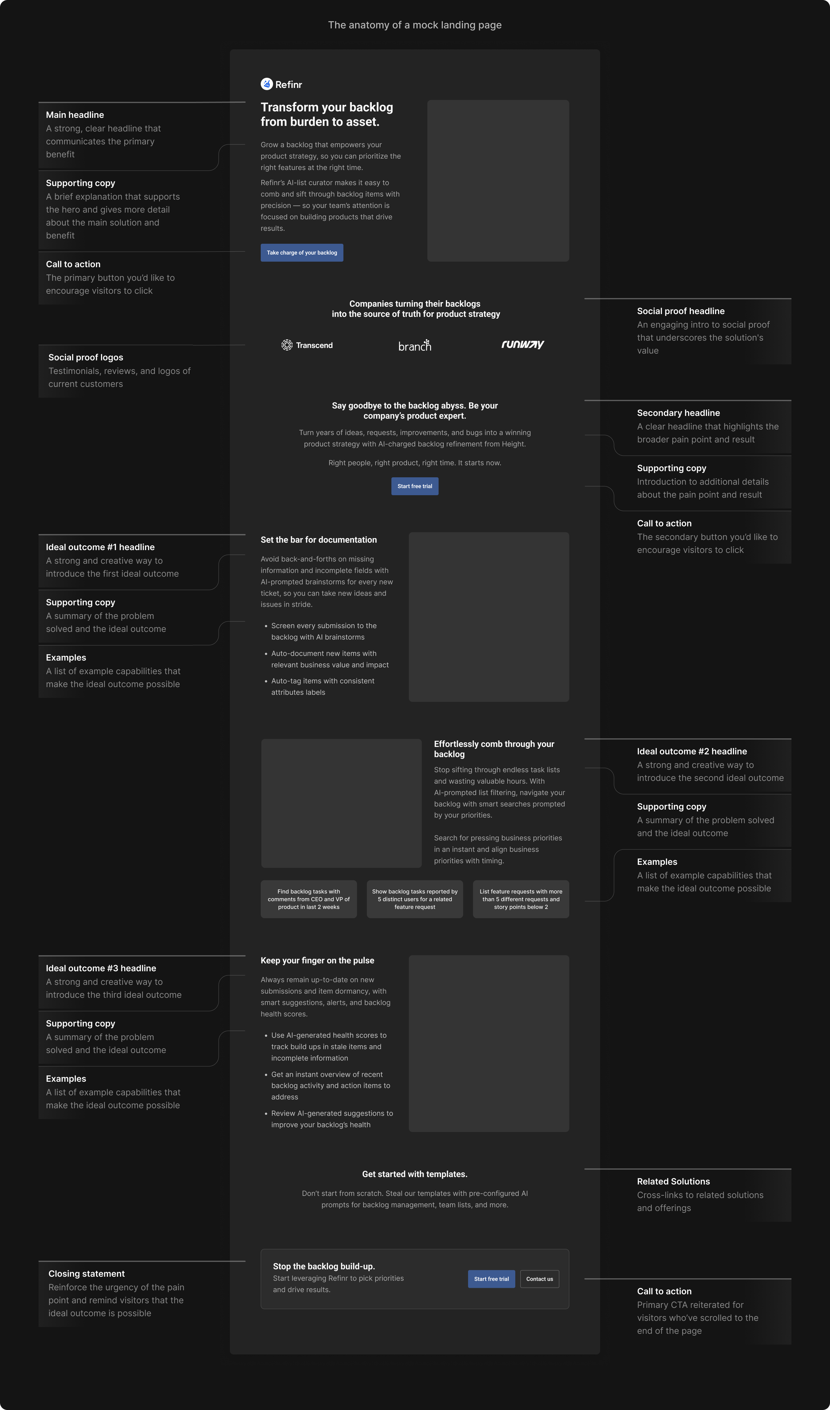
Once the team drafted initial copy, it was time to move it over to a real landing page wireframe design (Figma is a great tool to use for this). This process is what transforms static copy into an engaging, tangible format for the product team to consume. Creating the landing pages also forces you to streamline your message. Unlike a slide deck or a report, you only have so much real estate on a landing page, and must boil longform explanations to only the most essential key points.
Landing pages are designed to showcase a product's most important information, so when creating one, you must consider where the eye will naturally focus on the page. Doing so forces you to be precise, and to prioritize and organize your points in a narrative storyline that flows.
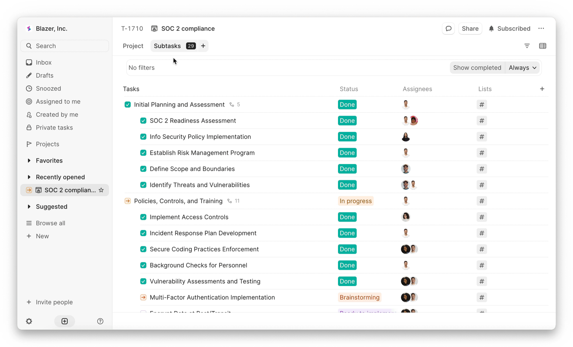
As an example, one of the landing pages our team worked on was for a backlog use case identified from user research, and required several rounds of revision. The process of going from initial copy to Figma landing page made it clear that some blocks of text written weren't compelling enough to deserve landing page real estate. Relatedly, the team also realized that some key information was being buried in the current layout, not displayed in a way to stand out. Upon realizing this, we focused on how to break up the copy to be more digestible, and aligned on which pieces of the story are most important.
Step 3: Presenting landing pages to the team
Think of presenting your mock landing pages to your product team like a product review: instead of just showcasing a list of findings from user research, you'll open up the conversation to be engaging, and consequently have more of a direct impact on the product roadmap. During the presentation, share the use case and what an ideal end state for customers could look like — that way, the product team can develop a more nuanced understanding of what's compelling and also feasible to build.
Although you're showcasing potential ideal end states in these presentations, remember that the goal is not to actually pitch specific features or product solutions to the product team. Presenting the landing pages should be more like hosting an open forum around potential solutions to build around, and to answer any questions that pop up on wording, evidence, and specific capabilities or pain points users expressed. When our team presented, no one was wed to anything shown. The landing page walkthroughs are really more of a collaborative brainstorm, where everyone knows some ideas will never make it past the idea stage. And ultimately, the goal here isn't for every use case presented in a landing page to get added to the product roadmap — the goal is to sharpen the focus and scope of your roadmap by identifying the top use cases to prioritize.
In fact, conversations about which use cases or ideal end states weren't as compelling helped clarify our focus as much as the conversations about standout, best-fit use cases. And while product teams always have clarifying conversations about features, it's much more efficient to define your product roadmap in advance of developing features versus iterating again and again on a feature based on feedback. After discussing and debating a mock landing page, everyone starts the product spec'ing process on the same page, eliminating later back-and-forth.
This process allows everyone to see through the eyes of a customer, sparking more effective product development
Though the mock landing pages are only for internal use, they allow the team to immerse themselves in the customer experience of evaluating a feature and deciding whether it's worth signing up or paying for. Instead of just reciting a list of pain points, these landing pages paint a picture of what an ideal end state looks like — recreating those frustrations and evoking emotional responses from the product team. Empathy rouses teams to action, and personally, inspired our team to rapidly start ideating solutions rooted directly in what we heard from customers.
To go back to our example of the backlog use case we developed: during user research, we consistently heard how frustrated people feel digging through endless backlogs to find high priority tasks. Instead of just reiterating this pain point, on the mock landing page, our page depicted an ideal end state: what would life look like if that wasn't a constant struggle people grappled with? Since this ideal end state resonated with the product team, and was a feasible use case for us to build solutions around, features around prioritizing the backlog landed on our product roadmap.
As our team worked on building features for 2.0's launch in October, the empathy created from the emotional responses to the mock landing pages carried all the way through the product development process. The landing pages and the conversations they sparked gave the product team an underlying understanding of why this feature matters. That way, they could make customer-centric decisions, rather than just building off a faint idea of the use case — and now, Height has autonomous backlog triage, eliminating the need for hours of frustrating manual work to keep the backlog tidy.
Particularly, the mock landing pages allow PLG startups to create more effective product roadmaps
Of course, building features to directly address user needs sets every team up for success. But this is particularly true for smaller, early-stage PLG startups.
Without in-house sales teams talking to customers and leads every day, gathering insights and relevant use cases, PLG companies can uniquely benefit from the landing page approach. Since the pages are fully grounded in learnings from user research, they prioritize information from conversations with customers about their day-to-day workflows and pain points.
Another key benefit of these mock landing pages for early-stage PLG startups is that they naturally pressure-test ideas before they make it onto the roadmap. For smaller teams with limited time and resources to build with, it's essential to only focus on building what will actually land. If the mock landing page doesn't showcase an end state that's clearly, overwhelmingly better for customers (and a fit with the core company mission), it won't be worth buying, or building.
By distilling user research insights into tangible end states and inspiring nuanced product discussions, the approach grounds product building in customer perspectives. More than anything, the mock landing page approach ensures that early-stage PLG teams develop a product roadmap fully aligned with the end outcomes their customers want and need most.
Sign up for Height 2.0 and get instant access to first-of-their-kind autonomous workflows